

Stepping into the office should feel like stepping onto your personal runway—professional, polished, and unmistakably you. Yet many of us shy away from print mixing, convinced it’s a high-risk fashion gamble best saved for weekends. What if you could inject creativity into your 9-to-5 wardrobe without sacrificing professionalism? With the right work-friendly print mixing tips, you’ll transform your outfits from “same old” to “stand-out” while still fitting seamlessly into any corporate dress code. Let’s explore how to master print mixing for the workplace, boosting your confidence and showcasing your personal style.
1. Start with a Neutral Base
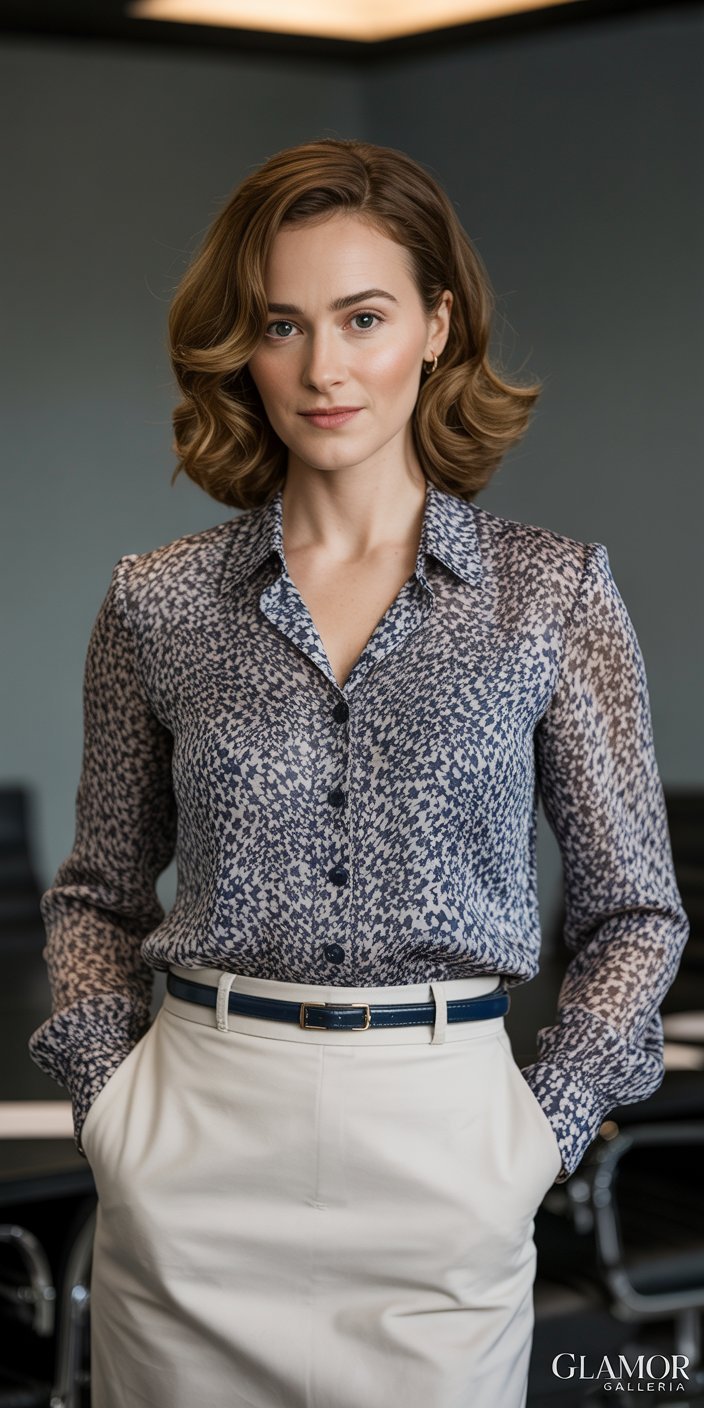
A neutral foundation keeps the focus on your prints without overwhelming the eye. Think classic black, navy, gray, or beige:

- Tailored trousers or pencil skirts in solid tones let patterned tops shine.
- Structured blazers in neutral shades balance out bolder prints underneath.
- Simple sheath dresses in monochrome work as the perfect canvas for a printed scarf or belt.
By anchoring your outfit in neutrals, you ensure your prints pop in a sophisticated, office-readied way—core to any set of reliable work-friendly print mixing tips.
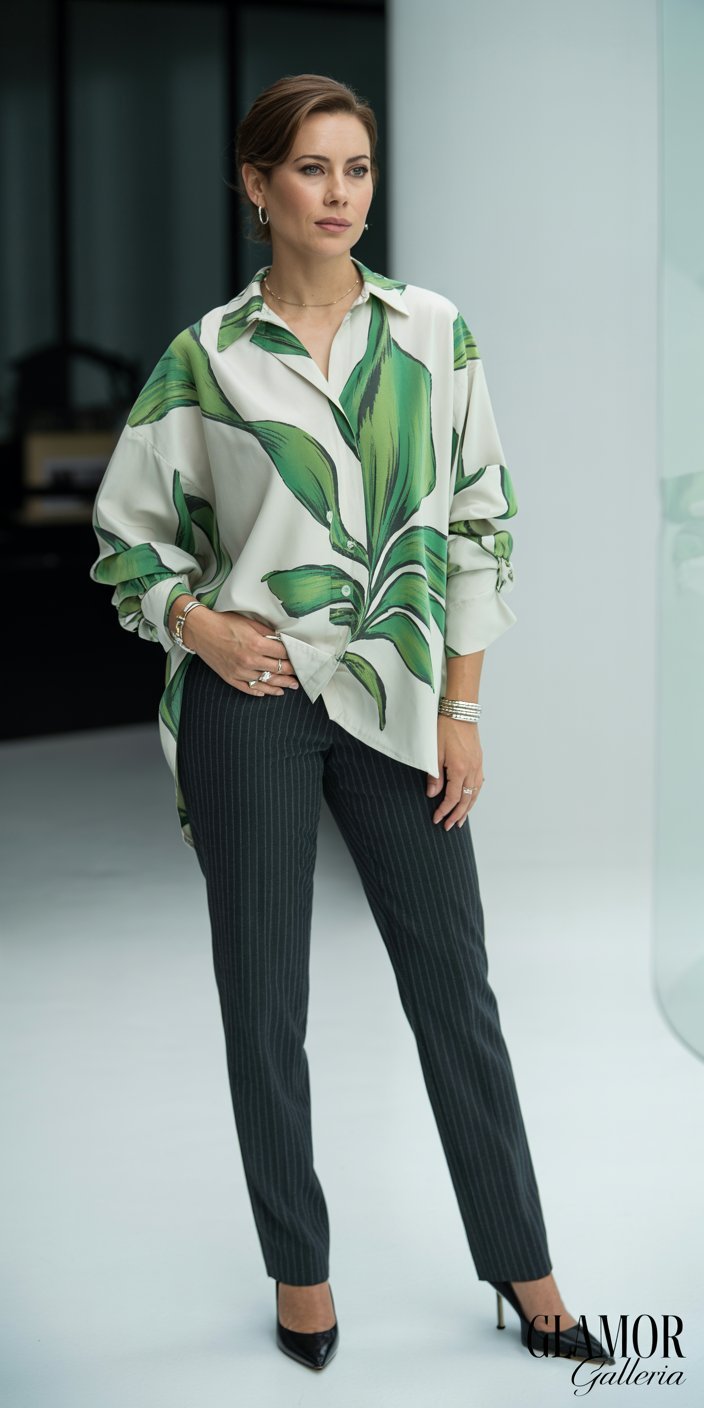
2. Pair Large Prints with Smaller Scales
Contrasting scale is a foolproof rule for mixing prints without clashing:
- Bold graphic or botanical prints (e.g., oversized florals)
- Subtler patterns (pinstripes, micro-dots, tiny geometric motifs)
Why it works: largescale prints draw the eye, while smaller prints fill in the gaps harmoniously. For example, a big-leaf floral blouse pairs beautifully with slim-stripe trousers—effortlessly chic and office-appropriate.
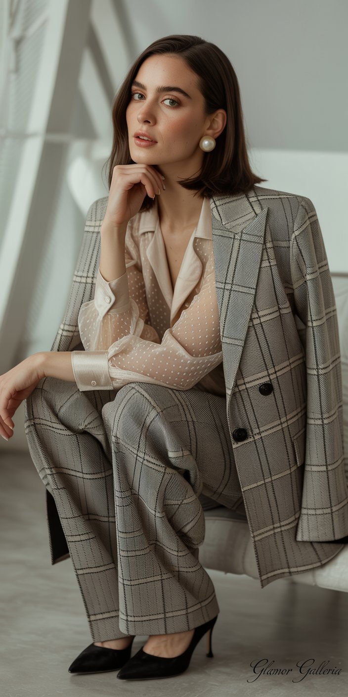
3. Stick to a Unified Color Palette
Limiting your palette to 2–3 complementary colors ties disparate patterns together:
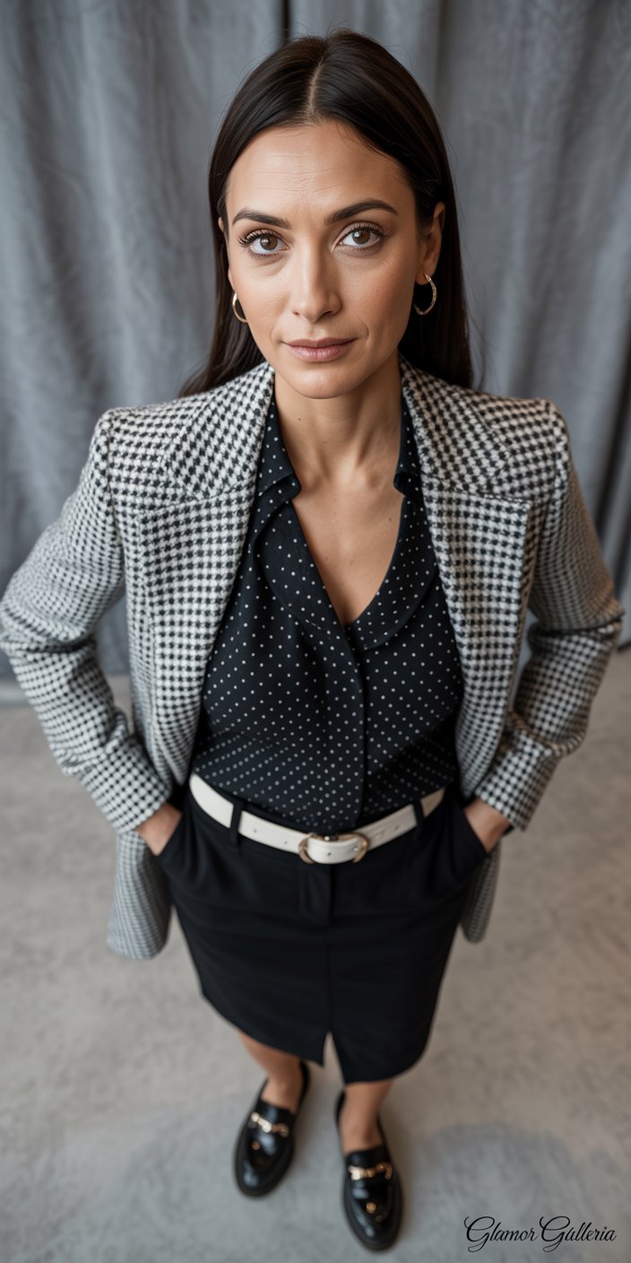
- Monochrome mix: Black-and-white houndstooth blazer with a black-and-white polka-dot blouse.
- Analogous tones: Navy and teal prints echo each other’s cool undertones.
- Accent color pop: A grey plaid skirt and grey striped top both feature a hint of burgundy—perfect for a subtle print blend.
By focusing on color cohesion, one of the most vital work-friendly print mixing tips, you avoid visual dissonance and maintain a polished look.
4. Lean on Classic Print Combos
Some print duos stand the test of time, especially in professional settings:

- Stripes + florals: A vertical-stripe shirt under a muted floral blazer adds dimension without drama.
- Plaid + polka dots: A soft-plaid pencil skirt anchors a tiny-dot sweater for feminine flair.
- Animal print + solids: A leopard-print scarf or belt adds edge to an otherwise basic outfit.
These pairings have been office-approved for years—mix and match with confidence!
5. Use Prints as Accent Pieces
If head-to-toe mixing feels daunting, start small:
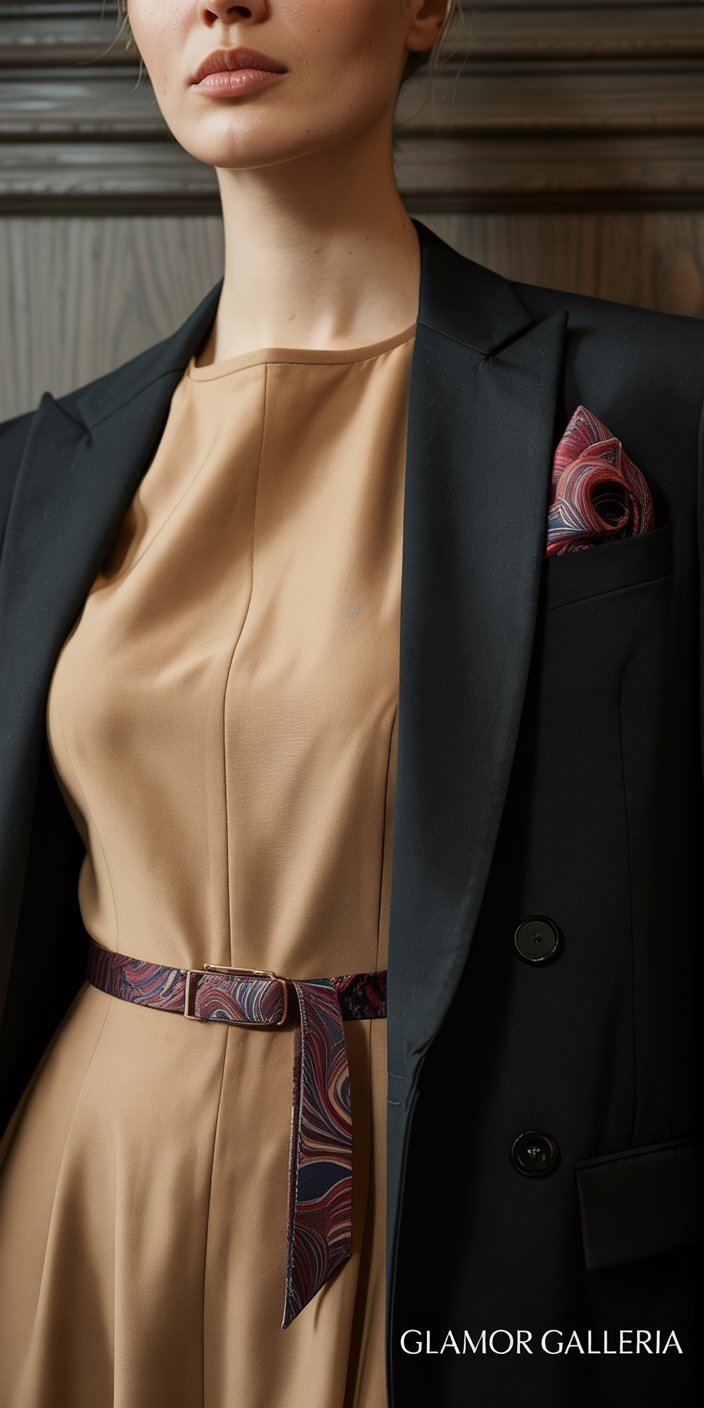
- Printed scarves
- Patterned belts
- Graphic silk pocket squares
- Subtle printed shoes
Layer your neutrals and let these accessories serve as focal points. This is a core “starter” strategy within work-friendly print mixing tips, helping you ease into bolder combinations without disrupting your professional aesthetic.
6. Anchor with Structured Silhouettes
When mixing prints, maintain clean lines to keep outfits office-friendly:
- Blazers and tailored jackets
- Straight-leg trousers
- Pencil skirts
- Shift dresses
Structured pieces anchor vibrant prints, preventing them from appearing too casual or bohemian. The result: a balanced, assertive look that commands respect in any boardroom.
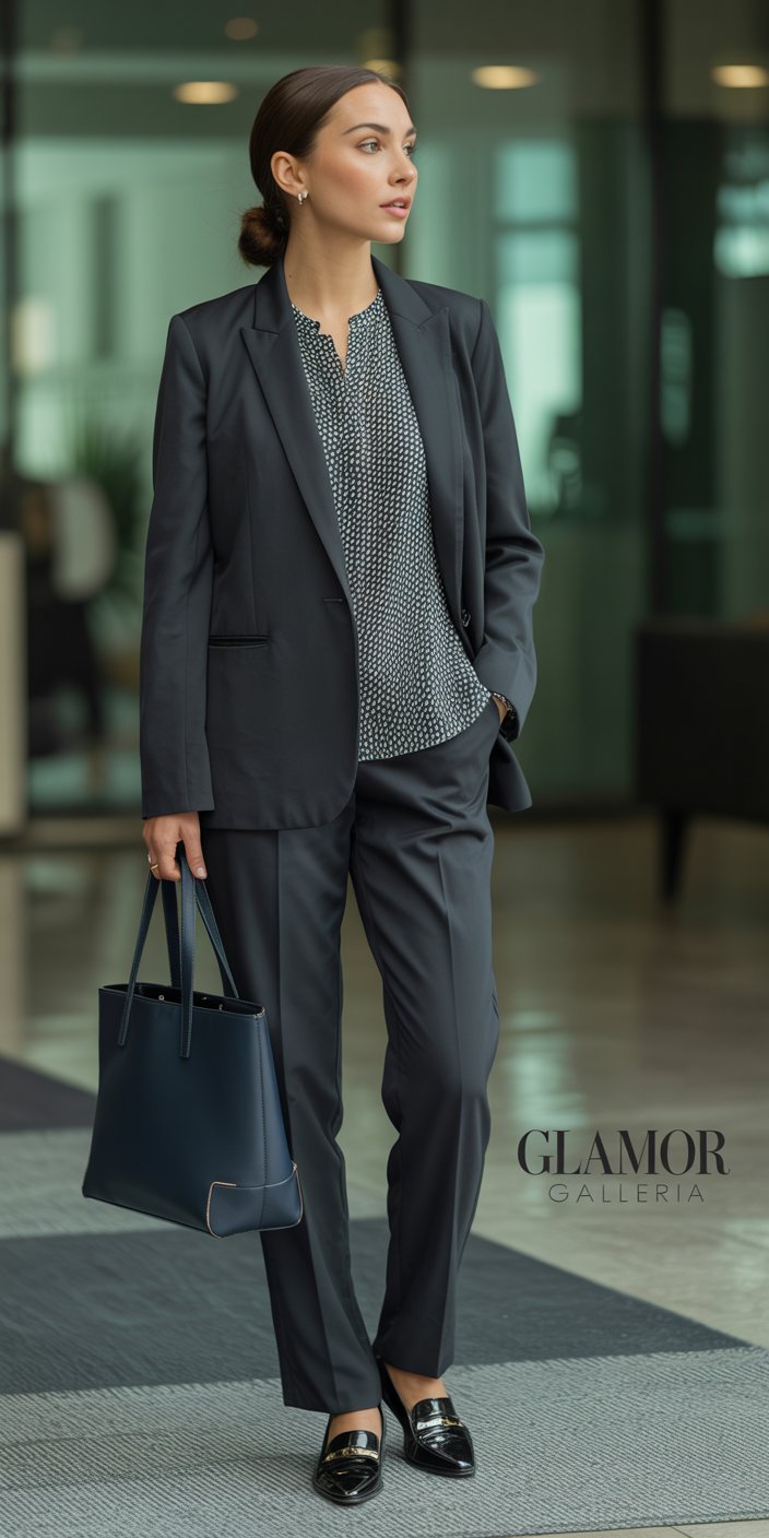
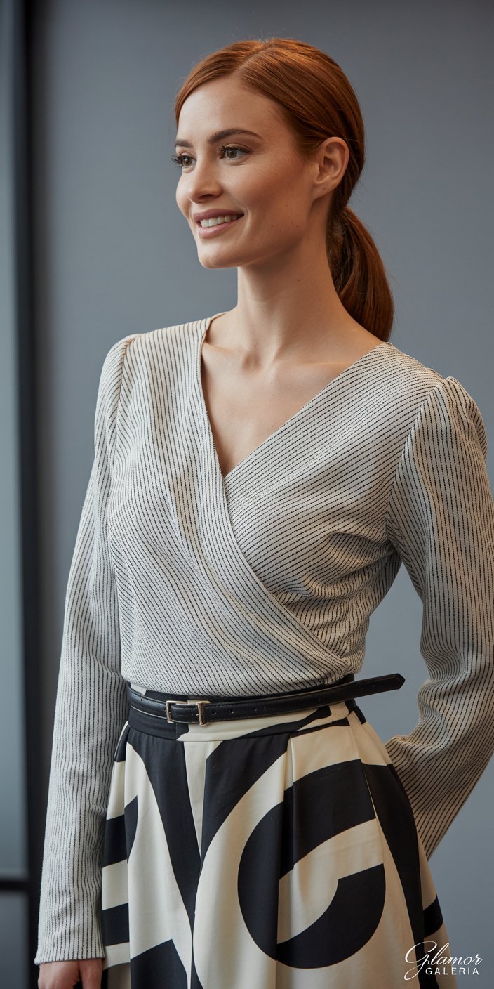
7. Balance Patterned Tops with Solid Bottoms (and Vice Versa)
One patterned element complemented by a solid piece creates harmony:
- Patterned blouse + solid skirt: Opt for a small-scale print top with a pencil skirt in one of the print’s accent colors.
- Solid top + patterned trousers: Match a neutral blouse to the dominant hue in your printed slacks.
This yin-yang approach is a cornerstone of work-friendly print mixing tips, giving you a safe yet stylish framework.
8. Mind Fabric Weight and Texture
Not all prints are created equal. Mixing fabric weights adds sophistication:
- Lightweight silks with heavier wool blends
- Sheer chiffon overlays on crisp cotton
- Matte knits paired with slight sheen prints
Texture contrast ensures prints complement rather than compete, while adding another layer of visual interest to your ensemble.
9. Consider Scale and Placement
Where a print sits on your body influences balance:
- Strategic placement of bold prints around the waist or shoulders draws attention to your best features.
- Diagonal or vertical patterns elongate the frame—ideal for mixing with horizontal micro-prints.
Play with orientation and placement to craft a visually flattering silhouette—a nuanced yet powerful addition to any set of work-friendly print mixing tips.
10. Finish with Polished Accessories
Complete your mixed-print look with refined accents that reinforce professionalism:

- Minimalist jewelry (stud earrings, delicate bracelets)
- Structured handbags in a coordinating neutral
- Classic pumps or loafers
- Crisp belts in leather or faux leather
These final touches tie together even the boldest print mash-ups, ensuring you look put-together from head to toe.
FAQ
1. Can I mix more than two prints in one office outfit?
Yes—with caution. Limit yourself to three prints at most, and vary scale (large, medium, small) while unifying colors. For instance, combine a large floral blazer, medium-scale stripes on your blouse, and a small polka-dot belt—all in a shared color palette. Following this structure keeps your look dynamic yet office-ready.
2. What are the safest prints for a conservative workplace?
Stick to classic, low-contrast patterns: pinstripes, subtle plaids (e.g., glencheck), and tiny dots. Pair these with your boldest prints as accent pieces—sleeveless tops under a neutral blazer or printed scarves—aligning with work-friendly print mixing tips for restrained environments.
3. How do I transition print mixing from work to after-hours?
Swap structured neutrals for more relaxed layers:
- Remove the blazer to reveal a printed camisole.
- Change your pumps for strappy sandals that echo one of your print’s accent colors.
- Add statement jewelry to elevate the look.
These minor tweaks take your prints from boardroom-appropriate to weekend-ready in seconds.
Conclusion
Mastering work-friendly print mixing tips empowers you to express creativity within the bounds of professional dress codes. By starting with neutrals, balancing scales and colors, and refining your silhouette, you’ll turn every office corridor into a catwalk. Ready to elevate your work wardrobe? Share your favorite print combinations in the comments below, subscribe for more style guides, and give one of these tips a try tomorrow—your colleagues will thank you for the inspiration!