
There’s nothing quite as invigorating for your wardrobe and spirit as perfectly paired patterns. Yet, for many, the idea of mixing prints feels like a high-stakes gamble: one wrong pairing and you’re left with a jarring clash that screams “fashion faux pas.” Whether you’re dressing for a day at the office, a weekend brunch, or a special event, mastering print mixing can transform even the simplest outfit into a showstopper. In this guide, we’ll explore the five most common print mixing mistakes and, more importantly, how to avoid them—so you can confidently conquer how to mix prints like a pro.
1. Clashing Patterns Without a Unifying Element
The Mistake

One of the quickest ways to derail an outfit is to pair prints that have nothing in common. Imagine a bold leopard print blouse with a vibrant floral skirt—both beautiful on their own, but together they can feel discordant.
Why It Fails
- Visual Overload: When two patterns compete for attention, neither has the chance to shine.
- Lack of Cohesion: Without a shared element, the eye jumps around the look without finding a resting point.
How to Avoid It
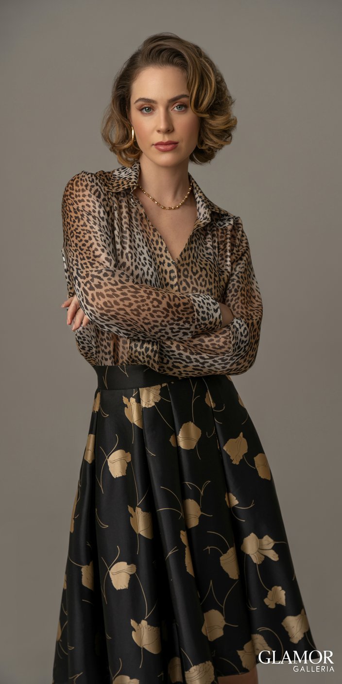
- Pick a Shared Color: Choose prints that share at least one hue. For instance, a navy polka-dot top paired with a floral skirt featuring navy accents creates instant harmony.
- Anchor with Solids: Introduce a neutral or solid-colored piece (e.g., a black blazer or white tee) that picks up on a color from both prints.
- Use Accessories: A belt, scarf, or handbag in a unifying shade can tie disparate prints together seamlessly.
Pro Tip: When in doubt, look for prints that include at least one identical shade—this single shared color acts as your visual “bridge.”
2. Mixing Too Many Prints at Once
The Mistake
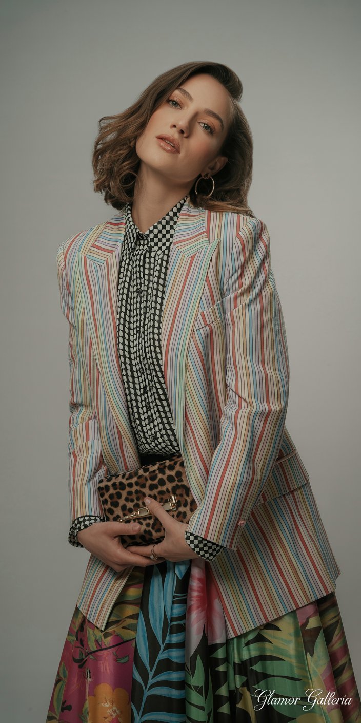
You love florals, geometrics, animal prints, and stripes—so why not wear them all? Unfortunately, layering more than two prints often tips the balance from stylish to chaotic.
Why It Fails
- Competing Focus Points: Each print fights for attention, resulting in a cluttered look.
- Overwhelming Proportions: Too many patterns can make your silhouette hard to read and your outfit appear heavy.
How to Avoid It
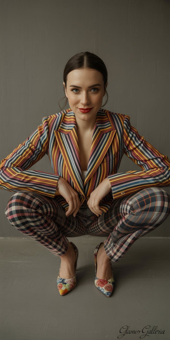
- Stick to Two Prints Maximum: A maximum of two prints keeps your outfit sophisticated. For example, a striped tee with a floral skirt, plus a solid jacket, feels balanced.
- Vary Scale: If you must go for three patterns, ensure they vary dramatically in scale (e.g., micro dots, medium florals, and wide stripes) and stick to the same color family.
- Neutral Buffer: If you’re adventurous and want that third print, introduce a neutral accessory (like a beige tote or nude shoes) to give the eye a place to rest.
Pro Tip: A monochrome print bag or shoe can feel like a pattern without adding another competing motif.
3. Ignoring Scale and Proportion
The Mistake
Pairing prints of the same size—like two medium-scale florals—can flatten your look and make it appear repetitive rather than dynamic.
Why It Fails
- Flat Visual Texture: Same-scale patterns merge into one large patch of busyness.
- Unbalanced Silhouette: Prints of similar weight can either overwhelm or underwhelm your frame without creating interest.
How to Avoid It
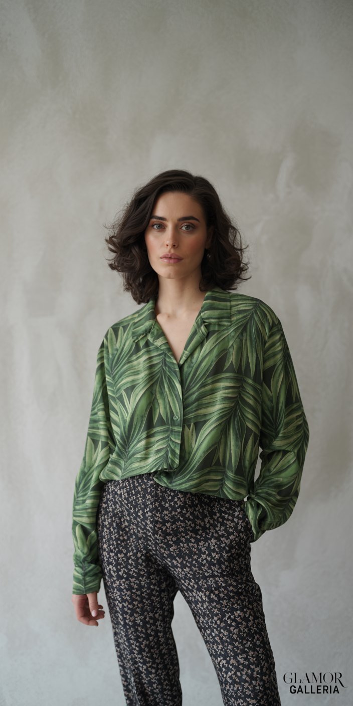
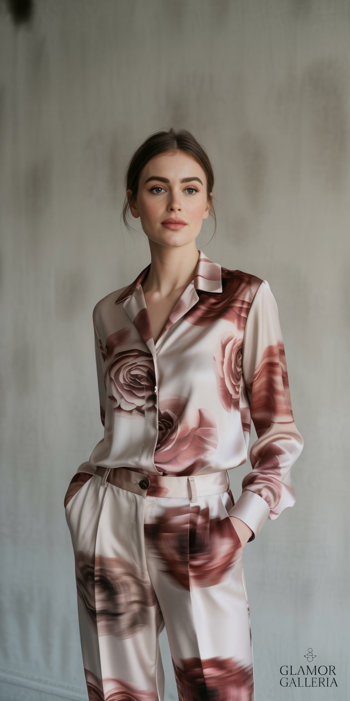
- Mix Large with Small: Pair a bold, oversized print (e.g., a large palm leaf pattern) with a tiny, ditsy floral. The contrast elevates both.
- Consider Placement: Use larger prints on areas you want to accentuate, and smaller prints on areas you’d like to minimize.
- Mind Your Body Shape: If you’re bottom-heavy, use a smaller-scale pattern on your lower half and a larger print on top to balance proportions—vice versa for those who carry weight in the upper body.
Pro Tip: A scarf or belt in a micro-print can serve as a punctuation mark against a larger patterned base.
4. Forgetting Tonal Harmony
The Mistake

You love mixing bright, saturated colors, but pairing a neon green dot blouse with a vibrant fuchsia floral skirt can feel like a color collision.
Why It Fails
- Harsh Contrast: Clashing intensities can create tension rather than cohesion.
- Distracting Palette: Oversaturated combos draw the eye in too many directions.
How to Avoid It
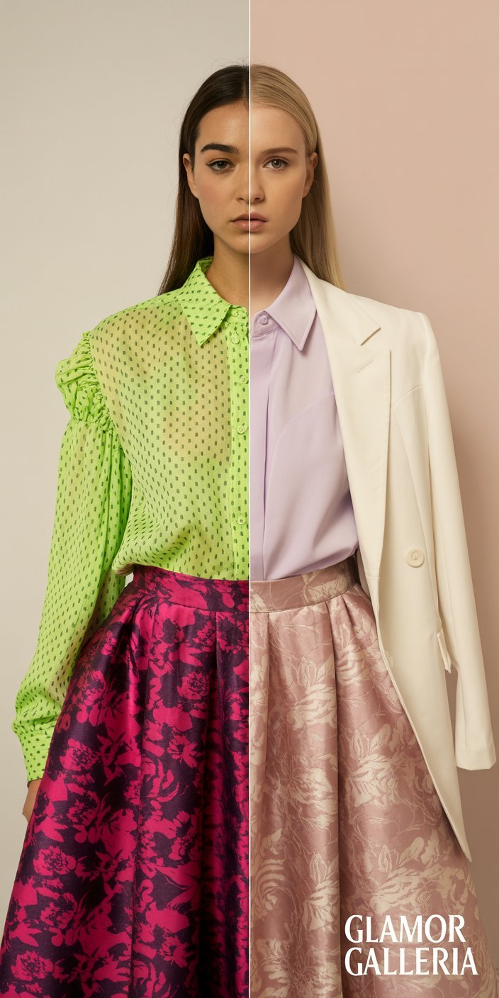
- Opt for Complementary Tones: Pair prints with colors that sit opposite each other on the color wheel (e.g., mustard yellow with deep purple) for a vibrant yet harmonious look.
- Utilize Muted Versions: If you love bold hues, look for prints in more subdued or vintage-washed versions of those colors.
- Neutral Grounding: Introduce neutral elements—cream, camel, charcoal—to soften and balance bright matches.
Pro Tip: Pastel versions of bold prints can offer that color interest without the sensory overload.
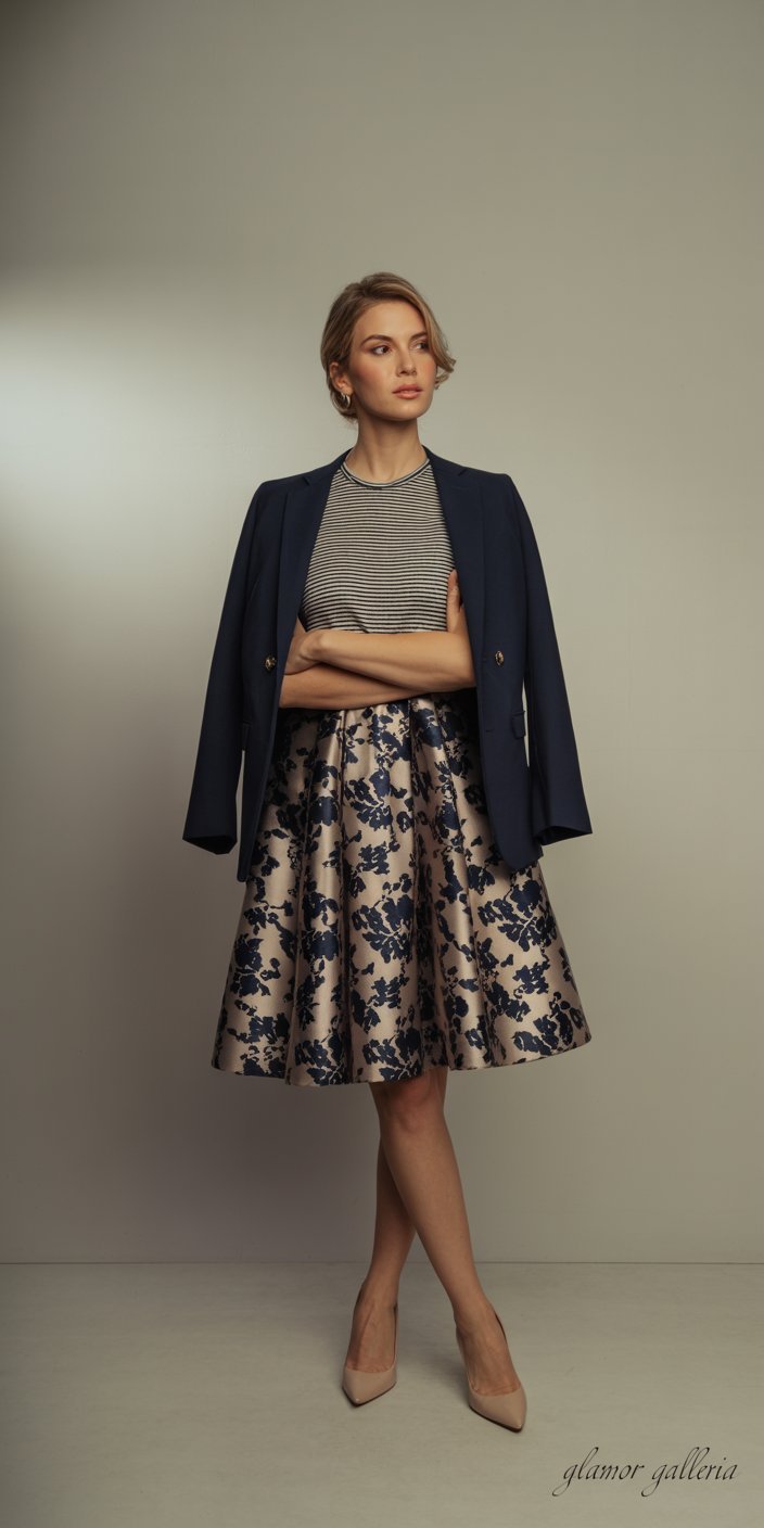
5. Neglecting Neutrals as Anchors
The Mistake
Going full print from head to toe might feel daring, but without neutrals to ground your look, it can drift into “costume” territory instead of “couture.”
Why It Fails
- Lack of Resting Space: No neutral means no visual break, which can tire the eye.
- Style Uncertainty: Without a neutral anchor, your outfit can feel undefined—where is the focal point?
How to Avoid It

- Layer with Neutrals: A neutral trench coat, solid camisole under a sheer printed blouse, or classic denim jacket can bring prints into wearable terrain.
- Accessorize Smartly: Bags, shoes, belts, and hats in neutral shades (black, tan, white, navy) provide contrast and elevate the prints.
- Balance Boldness: If your outfit features two statement prints, a neutral shoe and bag keep the look sophisticated.
Pro Tip: A neutral blazer instantly elevates even the boldest print pairing into professional territory.
Putting It All Together: A Step-by-Step Guide
- Choose Your Primary Print: Select the more dominant pattern you love (e.g., a large animal print dress).
- Identify a Secondary Print: Pick a smaller or contrasting-scale print that shares at least one color (such as a polka-dot scarf in the same shade palette).
- Anchor with Neutrals: Layer on a solid-colored piece—blazer, shoes, or handbag—to ground the look.
- Fine-Tune with Accessories: Add jewelry or belts in subtle tones to harmonize the prints.
- Check in Natural Light: Always review your outfit under daylight; indoor lighting can disguise clashes you’ll notice outdoors.
By following these steps, you’ll master how to mix prints without ever worrying about a style slip-up.
Frequently Asked Questions
1. What is the safest way to start learning how to mix prints?
Begin by mixing prints that share at least one color. For example, pair a navy striped top with a floral skirt containing navy blooms. Keep the scale ratio distinct (one large print, one small print) and introduce a neutral jacket or accessory to anchor the ensemble.
2. How many prints should I mix in one outfit?
For most occasions, limit your look to two prints. If you’re adventurous and well-versed in print mixing, you can experiment with three prints—just ensure they vary in scale and tonal harmony, and always include a neutral element to offset visual overload.
3. Can I mix different print styles (e.g., floral with animal prints)?
Absolutely—floral with animal prints can be a striking combination if you adhere to the rules of shared colors, scale contrast, and neutral anchors. For example, a leopard-print skirt paired with a small floral blouse in matching brown tones, plus a solid black blazer, can feel both edgy and refined.
Conclusion
Mastering how to mix prints is less about instinct and more about following straightforward guidelines: look for a unifying color, vary scale and tone, and ground your outfit with neutrals. By avoiding the five common mistakes outlined above, you’ll unlock the full potential of your patterned wardrobe and step into every situation with confidence.
Ready to experiment with print mixing? Share your favorite outfit combinations in the comments below, subscribe for more styling tips, and don’t forget to tag us on Instagram with #PrintMixPro when you put these tips into action. Your perfect print pairing awaits!