
Color has the power to evoke emotion, set a mood, and transform any space or design. Yet, with thousands of shades at our fingertips, choosing the right pairings can feel overwhelming. That’s why mastering the best color combinations is essential—whether you’re decorating your home, designing your brand, or planning your next fashion statement. In this article, you’ll discover eight enduring palettes, learn why they work so well, and gain practical tips for applying them in your own projects.
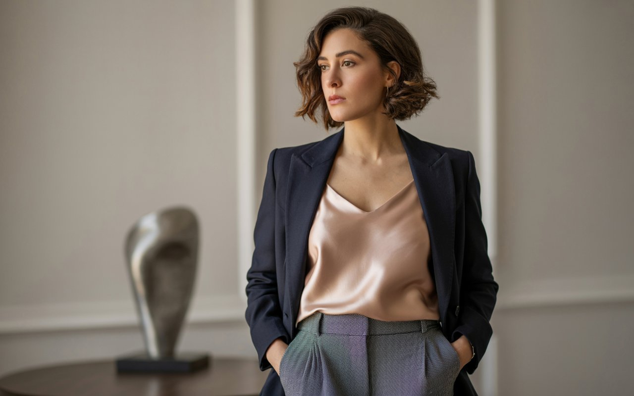
1. Navy & Blush: Classic Contrast with a Modern Twist

- Why it works: Navy’s deep, calming hue grounds the delicate warmth of blush, creating a balanced contrast that feels both sophisticated and approachable.
- Where to use it:
- Home decor: Navy walls paired with blush velvet throw pillows instantly elevate a living room.
- Fashion: A navy blazer over a blush silk camisole transitions from office formality to evening elegance.
- Branding: Use navy for primary logos and blush accents in marketing collateral to convey trustworthiness with a friendly edge.
Pro Tip: To keep the palette cohesive, pull in an accent neutral—like warm ivory—for furniture fabrics or stationery backgrounds.
2. Charcoal & Mustard: Bold Yet Understated
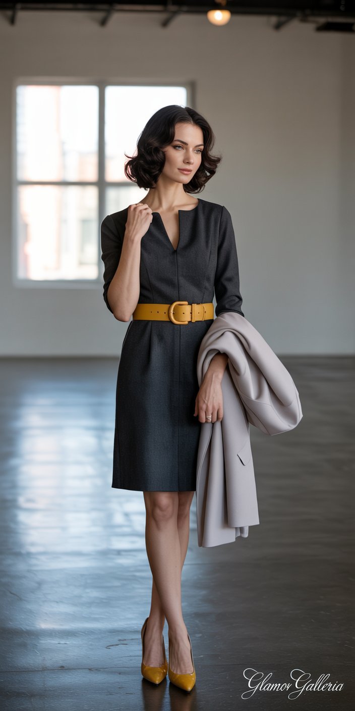
- Why it works: The deep, almost black charcoal provides a neutral canvas, while mustard introduces a burst of optimism without overwhelming the eye.
- Where to use it:
- Graphic design: Mustard call-to-action buttons on charcoal backgrounds demand attention.
- Interior accents: Mustard throw blankets against charcoal sofas create a chic focal point.
- Fashion: A charcoal sheath dress paired with mustard pumps makes a confident statement.
Step-by-Step Application:
- Start with charcoal as your dominant element (e.g., walls, large shapes, main text).
- Add mustard sparingly (e.g., accessories, small decor pieces, highlight text).
- Balance with white or light gray to avoid a heavy feel.
3. Emerald & Peach: Vibrant Harmony
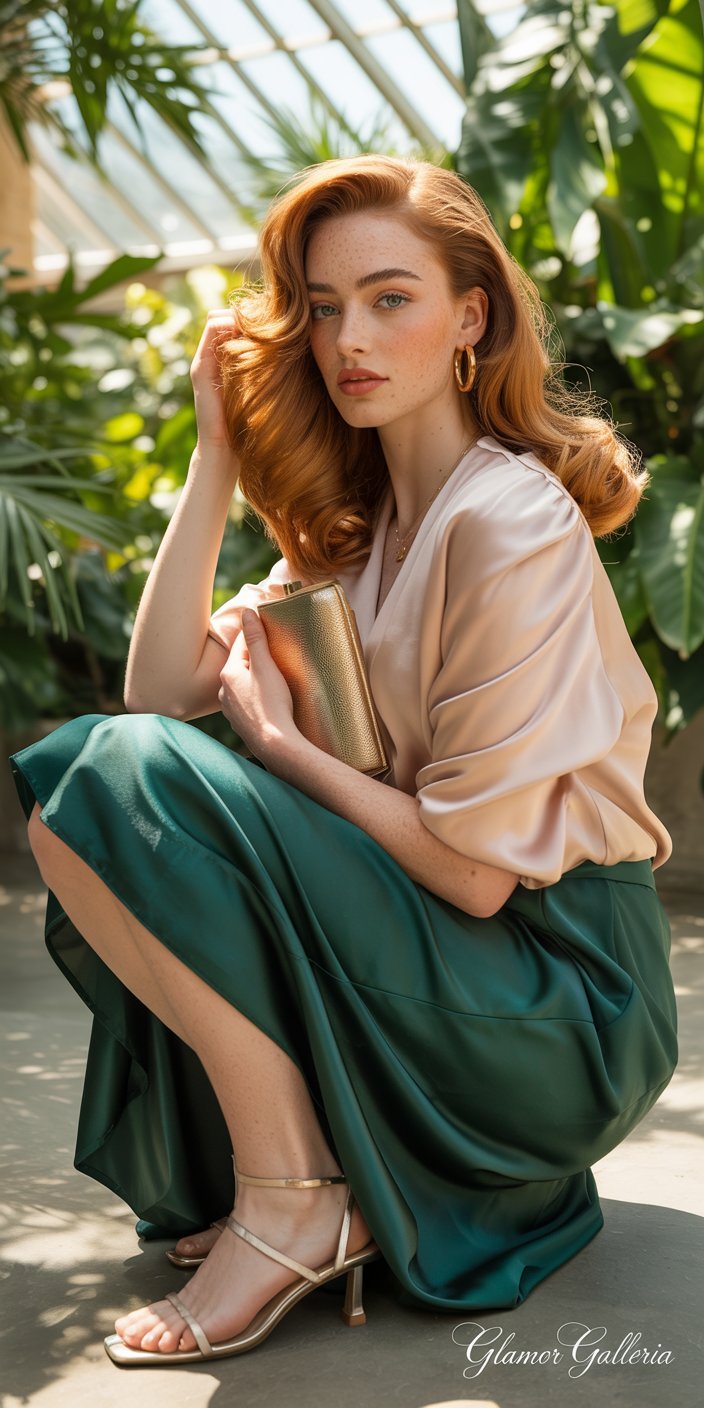
- Why it works: Emerald’s jewel-tone richness pairs beautifully with peach’s soft warmth, merging cool and warm without clashing.
- Where to use it:
- Weddings: Emerald bridesmaid dresses with peach bouquets feel fresh and upscale.
- Product packaging: An emerald background with peach typography feels inventive yet safe.
- Digital design: Use emerald icons on peach call-out boxes for eye-catching contrast.
Design Tip: Incorporate metallic gold accents—like picture frames or foil lettering—to enhance the pairing’s luxurious vibe.
4. Black & White: The Ultimate Timeless Duo
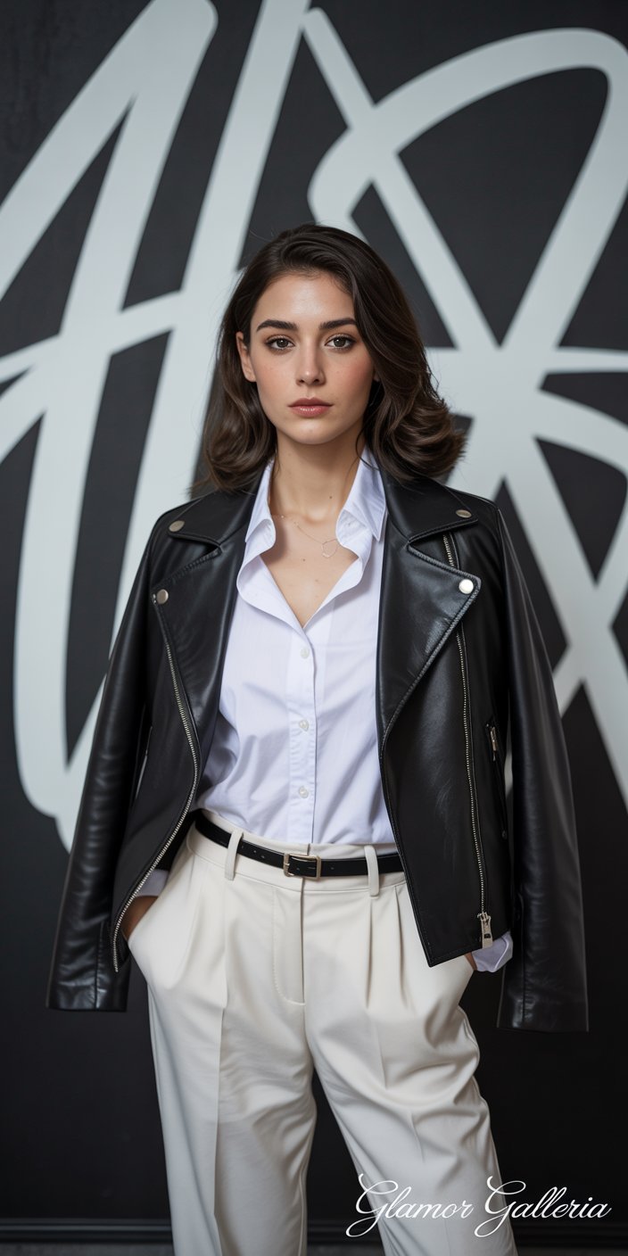
- Why it works: Monochrome pairs always read as refined and versatile. The stark contrast conveys clarity and modernity.
- Where to use it:
- Web design: Black navigation bars with white text ensure readability.
- Print materials: White letterpress on black stock feels tactile and high-end.
- Wardrobe: A crisp white shirt under a black leather jacket is perpetually stylish.
Practical Tip: Introduce texture—like matte vs. glossy finishes—to add depth without introducing color.
5. Teal & Coral: Energetic & Balanced
- Why it works: Teal’s cool vibrancy complements coral’s warm cheerfulness, creating an energetic yet balanced palette.
- Where to use it:
- Home accents: Teal area rugs paired with coral throw pillows enliven neutral rooms.
- Brand identity: Teal logos on coral backgrounds stand out on social media feeds.
- Fashion: Teal trousers with a coral top make a bold but wearable outfit.
Application Hack: Use coral for small pops (buttons, tags) and let teal dominate larger swaths (backgrounds, fabrics) for harmonious impact.
6. Olive & Terracotta: Earthy & Refined
- Why it works: Both colors draw from nature—olive’s muted green and terracotta’s warm orange-red—but their differing intensities create a sophisticated duo.
- Where to use it:
- Kitchen design: Olive cabinetry with terracotta dishware feels Mediterranean-chic.
- Brand packaging: Terracotta boxes with olive labels evoke artisanal quality.
- Fashion: An olive trench coat over a terracotta knit adds autumnal elegance.
Step-by-Step Styling:
- Anchor with olive on major elements (walls, outerwear).
- Accent with terracotta on accessories (pots, scarves).
- Soften with neutrals like beige or taupe.
7. Gray & Pastel Yellow: Subtle Sunshine
- Why it works: Gray tones down pastel yellow’s brightness, yielding a soft, contemporary palette that feels fresh yet grounded.
- Where to use it:
- Office decor: Gray desks with pastel yellow organizers spark creativity without distraction.
- Web UI: Gray interface elements with pastel yellow highlights guide user focus.
- Apparel: A gray pencil skirt with a pastel yellow blouse reads professional with a sunny twist.
Quick Tip: Introduce metallic accents (silver or chrome) for a polished, high-tech feel.
8. Burgundy & Blush: Romantic Depth
- Why it works: Burgundy’s rich depth balances the gentle femininity of blush, creating a luxurious and romantic palette.
- Where to use it:
- Event design: Burgundy linens with blush florals at weddings feel opulent.
- Beauty packaging: Blush boxes with burgundy foil logos feel high-end.
- Fashion: A burgundy wrap dress with blush heels transitions seamlessly from day to night.
Insider Advice: Use varying shades of blush—from pale to dusty rose—to prevent a flat look.
FAQ
Q1: How do I choose the right color combination for my project?
Start by identifying your project’s emotional goal: serenity, energy, luxury, or approachability. Then, consult a color wheel to explore complementary or analogous pairs. Finally, test your selected palette in small swatches or digital mockups to verify harmony under real-world lighting.
Q2: Are there tools that help generate these color combinations?
Yes—tools like Coolors and Adobe Color allow you to lock in one hue and automatically generate complementary or triadic palettes. These generators also provide HEX/RGB codes for seamless integration https://www.authorityhacker.com.
Q3: Can I safely combine more than two colors?
Absolutely. Triadic (three evenly spaced on the color wheel) and tetradic (four forming a rectangle or square) schemes can be vibrant and engaging. The key is to designate one dominant color and use the others as accents in smaller proportions.
Conclusion
Developing an eye for the best color combinations transforms every creative endeavor—be it interiors, branding, or personal style—into a visually compelling experience. By leveraging these eight timeless pairings, you can ensure your designs resonate, inspire, and remain effortlessly chic. Which color combo will you try first? Share your favorite palette in the comments below, subscribe for more design insights, and tag us on Instagram with your creations using #BestColorCombos!