
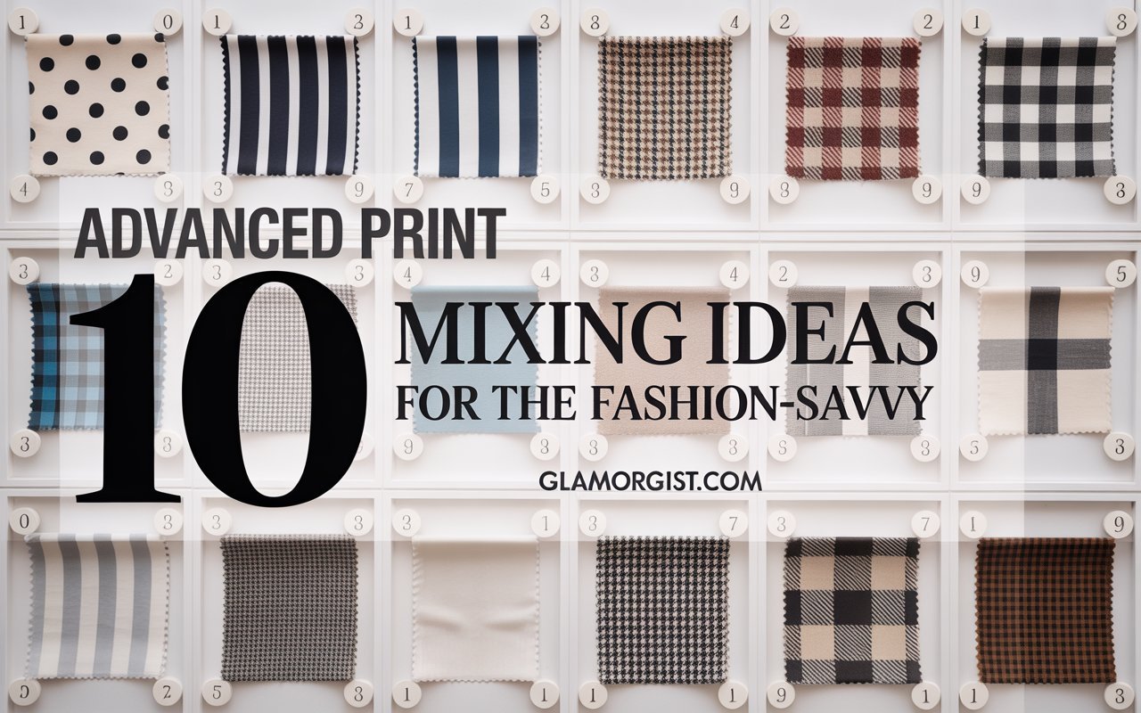
Print mixing is no longer reserved for fashion risk-takers—today’s style connoisseurs see it as the ultimate playground for self-expression. From the moment you step out in a head-to-toe clash of florals and geometrics, you’re sending a message: you’re confident, creative, and unafraid to break style rules. But advanced print mixing can feel like a high-wire act without a safety net. How do you balance scale, color, and texture without crashing into chaos? In this in-depth guide, you’ll discover how to mix prints like a seasoned stylist, with ten sophisticated ideas that elevate your wardrobe from “nice” to “jaw-dropping.”
Why Every Fashion-Savvy Pro Needs to Know How to Mix Prints
- Endless Outfit Variations: Mastering print mixing means multiplying your styling options—one skirt, two tops, three prints, infinite looks.
- Personality on Parade: Prints are visual shorthand for your moods and passions; mixing them amplifies your unique story.
- High-Impact Minimalism: By combining two or three prints judiciously, you create maximal visual interest without an overcrowded closet.
- Season-Proof Styling: Swap print pairings seasonally—tropical leaves with neutrals in summer, wintry plaids with houndstooth in fall—to stay perpetually fresh.
Printing Principles: The Keys to How to Mix Prints

Before diving into advanced combos, anchor your approach in these core tenets:
- Unified Color Palette: Anchor prints in 1–2 shared hues (e.g., black-and-white, navy-and-ivory) to maintain cohesion.
- Scale Contrast: Pair large-scale motifs (oversized florals, broad stripes) with small-scale patterns (micro-geos, pin dots) to balance the eye.
- Textural Harmony: Match fabric weight and finish—silk with silk, wool with wool—to avoid competing sheens or drapes.
- Neutral Anchors: Introduce a solid in the same palette (blazer, belt, shoe) to give the eye a place to rest.
- Print Weighting: Let one print be the “hero” (covers more surface area) and others play supporting roles (accessory, accent).
10 Advanced Print Mixing Ideas for the Fashion-Savvy
1. Monochrome Pairs + Neon Pop
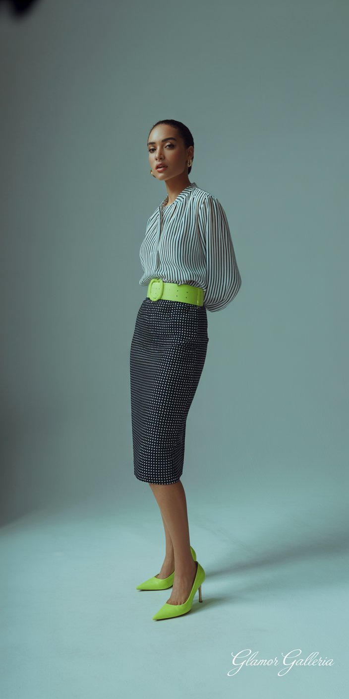
- Idea: Combine two monochrome prints—think black-and-white stripes with polka dots—and anchor with a neon accessory (bag, belt, heels).
- Why It Works: The neutrals keep harmony, while the neon introduces an electrifying edge.
- Pro Tip: Match neon to the print’s undertone (cool vs. warm) for a sleeker look.
2. Analogous Color Printing
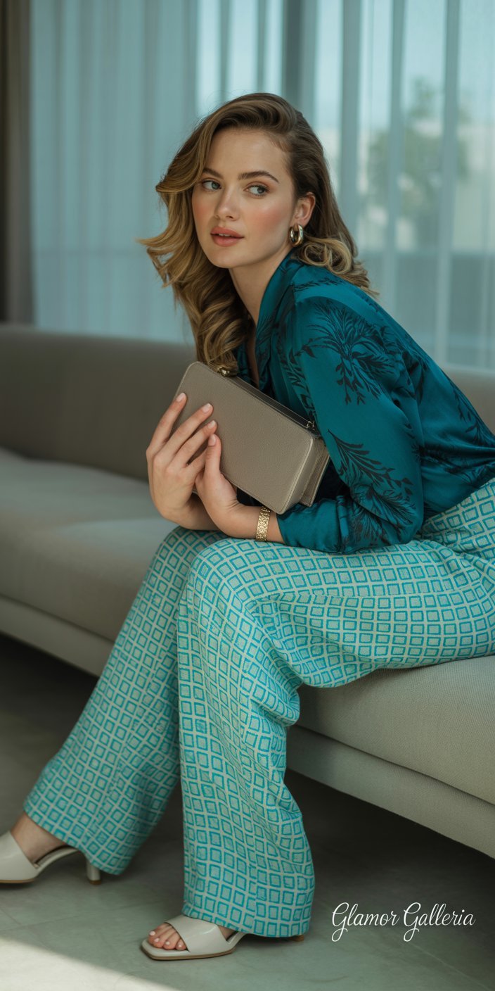
- Idea: Mix prints in adjacent color families (teal florals with aqua geometrics).
- Why It Works: The spectral proximity feels intentional and sophisticated.
- Step-by-Step:
- Choose one dominant hue (e.g., teal).
- Find two prints: one primarily teal, one with aqua or navy accents.
- Balance with off-white or stone neutrals.
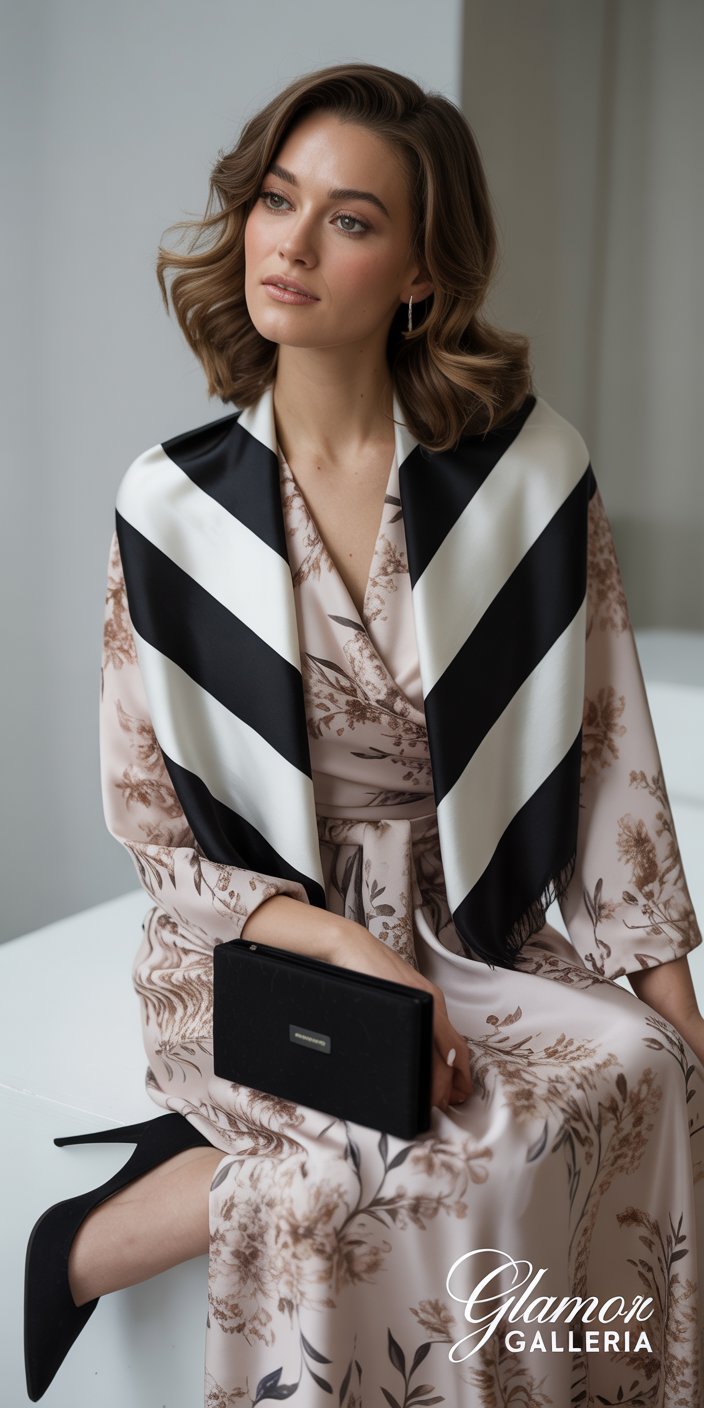
3. Texture-Driven Pairings
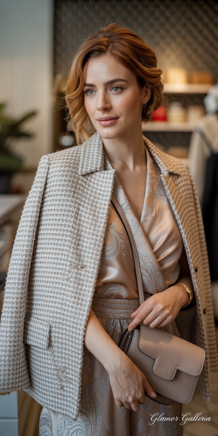
- Idea: Fuse a textured print (bouclé houndstooth) with a smooth print (silk paisley).
- Why It Works: The tactile contrast deepens visual interest beyond color or scale.
- Styling Tip: Keep textures in the same weight family—lightweight tweed with chiffon, medium-weight jersey with modal.
4. Gradient & Ombre Prints
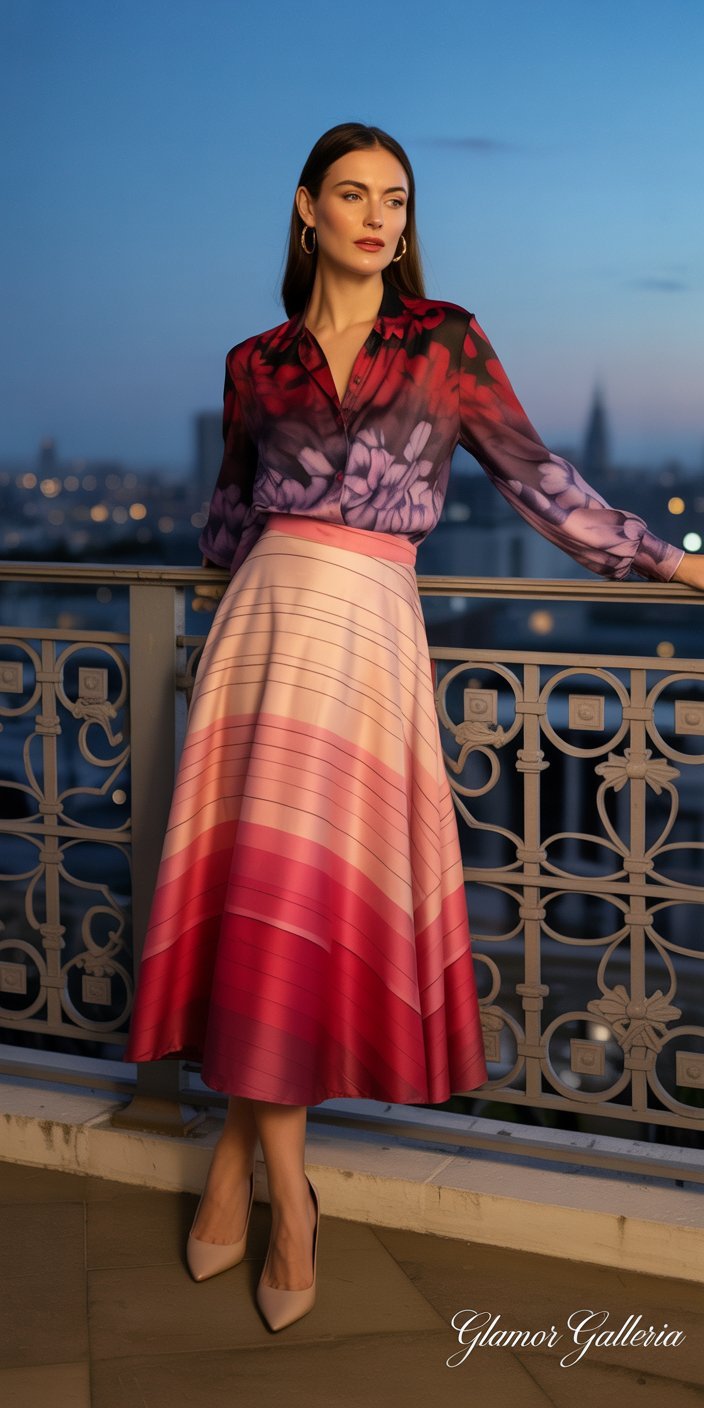
- Idea: Layer two ombre prints in the same color story—fuchsia-to-red stripe skirt with a red-to-burgundy floral top.
- Why It Works: The gradient flow reads as one cohesive scheme, even when the motifs differ.
- Practical Hack: Use prints that fade in opposite directions to create framing effects.
5. Opposites Attract: Florals + Geometrics
- Idea: Anchor a delicate floral print with a bold diamond or chevron motif.
- Why It Works: The organic shapes of florals soften structured geometrics, yielding dynamic tension.
- Quick Fix: Start with a printed dress and add a geometric scarf or jacket for instant drama.
6. Seasonal Swap: Summer Tropicals + Fall Plaid
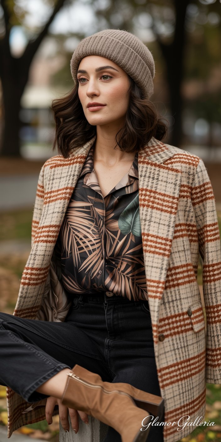
- Idea: Pair warm-weather leaf prints with autumnal tartans—think palm fronds and muted plaid.
- Why It Works: The seasonal juxtaposition shows fearless style and extends the life of your prints.
- Tip: Introduce texture (a wool plaid blazer) to signal seasonal shift without overhauling the look.
7. Mini-Print Overload with Solid Grounding
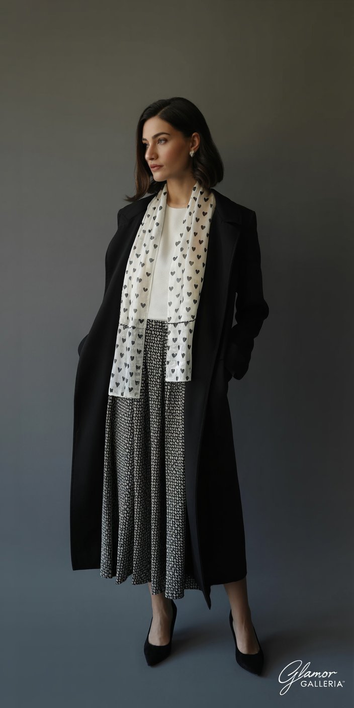
- Idea: Wear two or three micro-prints (tiny hearts, mini geometrics, micro paisley) together, anchored by a single-color blazer.
- Why It Works: Small-scale prints layer without competing, creating depth akin to a collage.
- Step-by-Step:
- Choose 2–3 mini-prints in the same palette.
- Layer under a solid blazer or duster.
- Accessorize minimally—simple studs or a thin chain.
8. Sporty Luxe + Botanical Glam
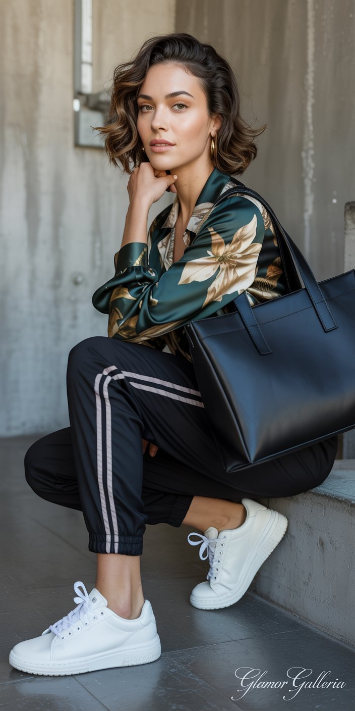
- Idea: Combine an athletic stripe or track print pant with a luxe botanical print blouse.
- Why It Works: The contrast between sporty ease and delicate florals gives a modern, eclectic vibe.
- Styling Tip: Finish with leather sneakers and a structured tote to keep the mix high-low balanced.
9. Metallic Prints + Matte Patterns
- Idea: Mix a metallic jacquard print (bronze ikat) with a matte woven pattern (charcoal herringbone).
- Why It Works: The shimmer of metallic echoes glammed-up eveningwear, while the matte ground keeps it wearable.
- Practical Application: Use metallics in small doses—belt, clutch, or a jacket panel—to avoid feeling like a disco ball.
10. Print in Print: Statement Accessories
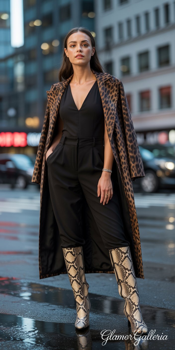
- Idea: Offset a printed outfit with an equally bold printed accessory—snake-print boots with leopard-print coat.
- Why It Works: When done right, overlapping animal prints can feel as artful as a curated outfit painting.
- Pro Tip: Keep the rest of the ensemble ultra-simple (all black or all white) so the prints shine without chaos.
Bringing It All Together: A Step-by-Step Styling Workflow
- Choose Your Base Print: Start with the piece you love most—printed dress, trousers, or blouse.
- Select Complementary Print: Apply color-palette and scale-contrast rules to find your second print.
- Anchor with a Neutral or Solid: Add a jacket, belt, or shoes in a matching tone for visual rest.
- Layer Textures and Fabrics: Mix weight and finish (silk with wool, leather with linen) to add depth.
- Accessorize with Intent: Opt for 1–2 statement accessories—earrings, bag, or shoes—to finish the look.
- Photograph and Refine: Snap a mirror shot. If it feels overwhelming, swap one print for a subtler version.
FAQ
Q1: What fabrics work best when mixing prints?
Fabrics with similar drape and finish—silk with silk, wool blends with tweed—create harmony. Mixing drastically different textures (e.g., stiff denim with delicate chiffon) can work if done intentionally, but generally start with like weights to focus on print interplay.
Q2: How can beginners safely experiment with advanced print mixing?
Start small: pair a printed accessory (scarf, bag) with one printed garment. Once comfortable, introduce a second print following scale-contrast rules. Use neutrals—black blazers, white shirts—as stabilizers until you gain confidence.
Q3: Can I mix more than two prints at once?
Yes—once you’ve mastered two prints, add a third in minute doses (shoes, belt, or jewelry). Ensure all prints share at least one color to maintain cohesion, and vary scale (large, medium, small) to avoid visual clutter.
Conclusion
Advanced print mixing transforms your wardrobe from predictable to personality-packed. By mastering how to mix prints—balancing color, scale, texture, and focal points—you’ll step out in ensembles that captivate and inspire. Ready to push your print boundaries? Share your boldest mix in the comments below, subscribe for weekly style deep dives, and tag your #PrintMixMasterpiece on Instagram. Your next standout outfit awaits!